CSS box model
As you develop your web page, you need to be aware of the CSS Box Model. The CSS Box Model is fundamental to arranging and expressing organization in content on the page. We can think of the HTML element as a box; each box has a length and a width, padding, a border, and margin.
What Is the CSS Box Model?
The CSS Box Model is a method of calculating how much space an element takes up on a webpage. The Box Model has four parts:
- Content: is the actual content that is in the element, including text or images.
- Padding: is the space between the content and the border of the element.
- Border: is the line that surrounds a padding (or content without padding).
- Margin: is the space beyond the border that separates one element from its neighbor.
Visualizing the Box Model
Here's how the Box Model looks conceptually:
---------------------------- margin
|                          |
|           border         |
|          -----------       |
|          | padding |       |
|          |---------|       |
|          | content |       |
|          |---------|       |
|          -----------       |
|                          |
----------------------------
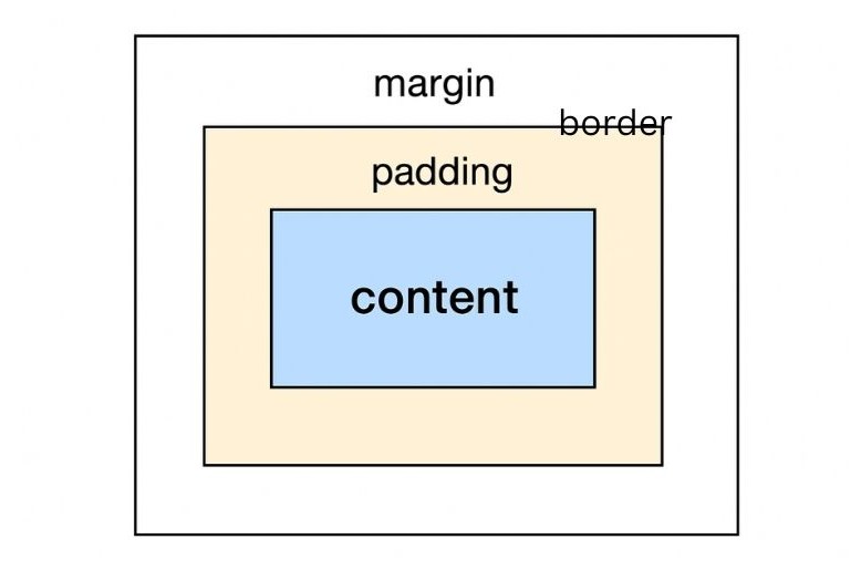
This visual may help you see how each layer surrounds the content.
How the box model can affect layout
The Box Model directly influences how elements are sized and positioned on a web page. For example:
- When you set the
widthof an element, it only includes the content (unless you use thebox-sizingproperty). - The
widthandheightdo not include the padding, margin, and border, which all increase the size of the element.
CSS Properties Related to the Box Model
To manipulate the Box Model, you use these properties:
widthandheight: Defines the size of the content box.padding: Adds space inside the elementli>border: Adds a visible line around the paddingmargin: Creates space between elements.
The Role of box-sizing
The box-sizing property modify how the total width and
height are measured. It has two main values:
content-box(default):widthandheightonly applies to the content, padding, and border are not included.border-box:widthandheightincludes padding and border, it essentially takes the calculations out of the layout.
Example
  /* Default behavior (content-box) */
      div {
      width: 200px;
      margin: 10px;
      padding: 10px;
      border: 5px solid black;
     }
  /* Total width will be 200px (content) + 2 * 10px (padding) + 2 * 5px (border) = 230px */

      /* Default behavior (content-box) */
      div {
      box-sizing: border-box;
      width: 200px; /* Total width includes padding and border */
      padding: 10px;
      border: 5px solid black;
      }
  /* Content width will be 200px - 2 * 10px (padding) - 2 * 5px (border) = 170px */
Common Box Model Challenges
Web developers frequently face these challenges when working with the Box Model:
- Elements overlapping due to improper margin or padding values.
- Unintended spacing caused by default browser styles.
- Difficulty in aligning elements precisely.
Stylish Practices for Using the Box Model
Successfully using the CSS Box Model will come down to few factors:
- Using the
box-sizing: border-box; property,;this will help to better visualize the contents of your layout, in the future. - Browser default styles can be unified with a CSS Reset/Normalise stylesheet; this will enable your designs to have one approach and foundation.
- Test across different screen sizes to ensure spacing/alignment is correct across devices.
- Use browser developer tools to inspect boxes of elements.
Conclusion: Master the Box, Master the Layout!
The CSS Box Model is one of the most important concepts every web developer should learn. Understanding the various parts of the box model and how they work together will allow you to have exact control over your layouts and make sure they are aesthetically pleasing and usable.
So, be proud standing next to the Box Model and allow your web creations to blossom!